OrangeShine: UX/UI Landing Page Redesign
Challenge:
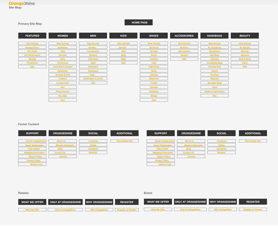
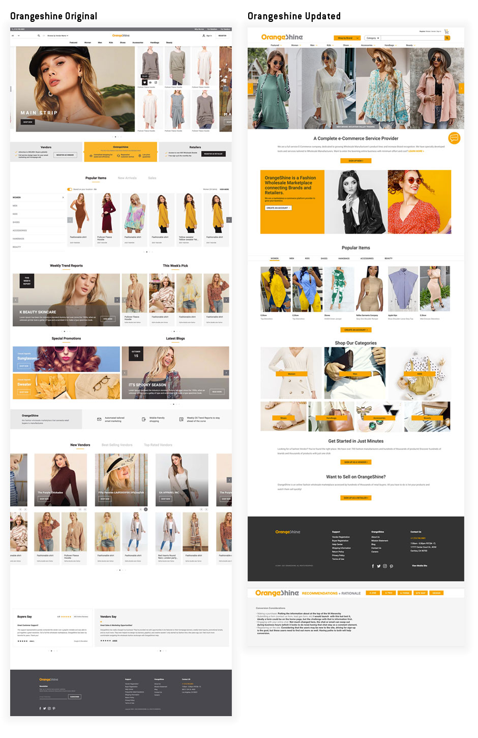
Orangeshine.com has a lot going on with there homepage. They are both selling to consumers as well as promoting co-op sales with retail and eCommerce shops. The navigation alone shows the excess of content and overburden on the user having fifteen navigational locations — breaking a key navigational rule of a maximum of seven. The goal of this project was to analyze the landing page, workflow, site architecture and heirarchy and provide recommendations. This included some areas related to accessibility (A11y) and the overall workflow. Landing page focus, conversion and simplification is the goal for this effort.
Process:
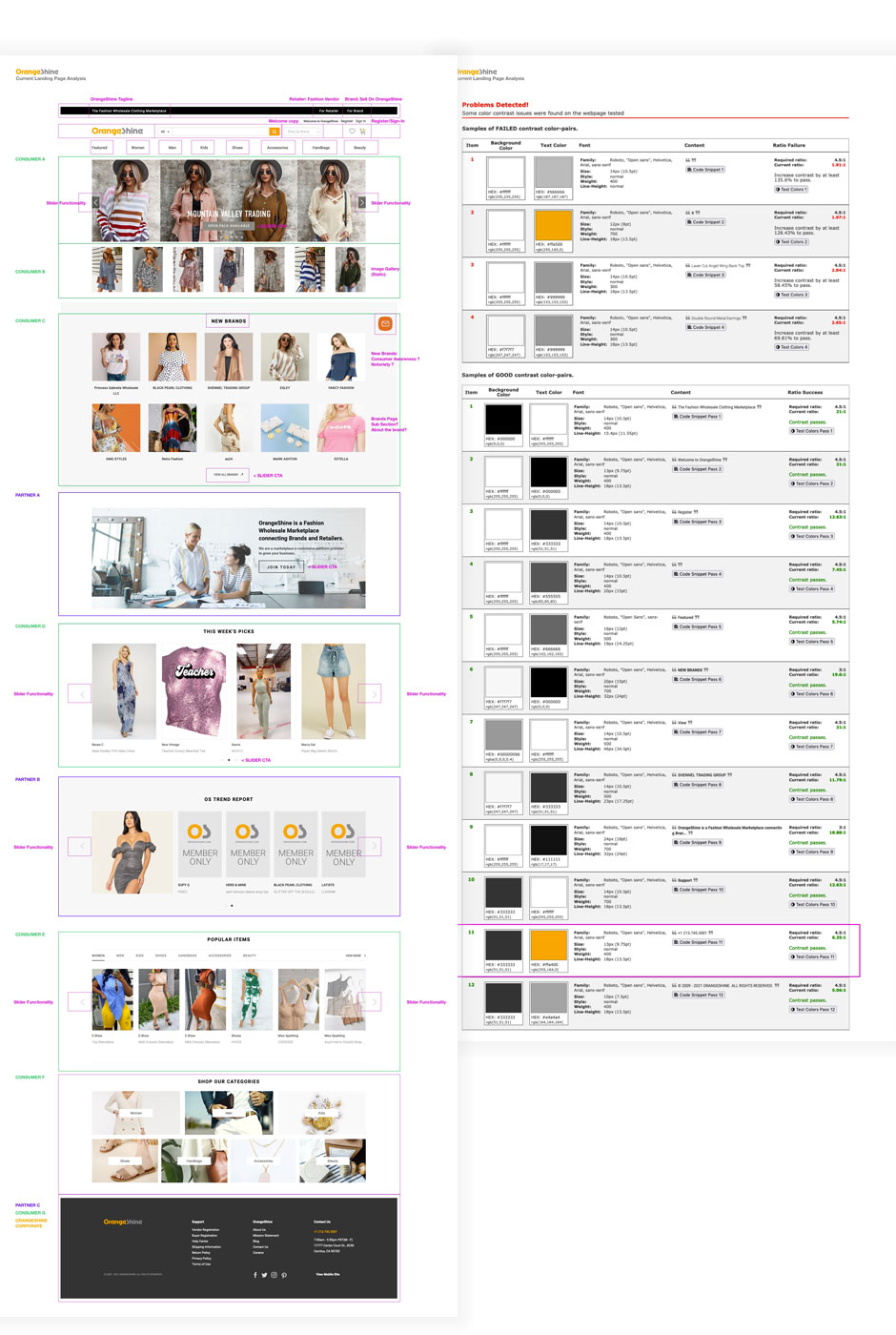
Site analysis was the start of the process, by looking at shorfalls on the landing page and really starting with best practices — this provided plenty of opportunities for improvement.
Processes Used:
- Page UX Analysis
- Experience Architecture
- Site Maps + User Flows
- Product Features Analysis
- UI Design System Evaluation
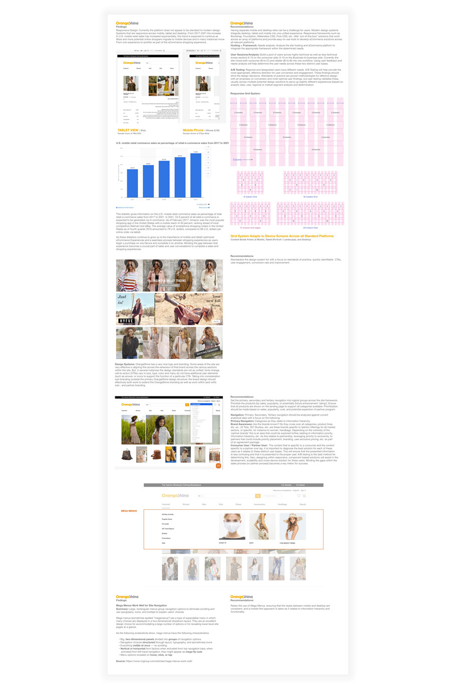
- Responsive Analysis
- Accessibility Analysis (A11y)
- UX Design Recommendations
- Analytics Next Steps Recommendations
Results:
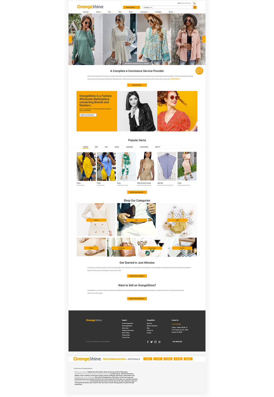
The clean, simplified and user-friendly landing page provides a stark contrast to the heavy congnitive overload with the original. This allows quick access to both users: consumers and potential partners.
Improvements:
- Simplified Navigaiton
- Informaiton Heirarchy Improvements
- Above the Fold Refinement
- Chat Feature Placement
- Wholesaler as Secondary Content
- Highlighting Most Popular Items
- Categories: Shopping Placement
- Co-op direct CTAs
- Simplified Footer
- Analytics / Next Steps Recommnedations
- Accessibility Compliance
- Mobile / Responsive Page Grid Guidelines
Review the analysis and proposed UX Design Recommendations here.